Layout
Grid
This component is deprecated.
We recommend using native grid instead for accessibility and performance reasons.
To help create cohesive page layouts, apply this flexible 12 column grid by using a container with rows and columns.
Grid container
The class .l-container
It is important to not use containers in a shell or parent component, as doing so limits the flexibility within the page view.
You can have multiple containers on a page view. Containers are not usually nested.
Behaviour
To visually balance the amount of whitespace on a page, left and right padding changes proportionally over breakpoints:
- Below the
ll - Between
llxl - Above the
xl
Row
A row allows columns to align to the grid. Rows can only ever have columns as direct children.
Example
Column
The width of columns can be set at each breakpoint, using one of the 12 sizes available. You can nest more rows and columns inside a column.
Example
Example
Behaviour
pullpushoffsetmargin-left
Full-width areas
Grid container can’t be used for full-width areas on the page as it comes with preset padding and a max-width.
The recommended way to achieve a full-width area is to:
- Close the current
.l-container - Open a
div - Close the full-width
div - Add another
.l-container
If you use rows and columns inside the full-width area (without an .l-containerdiv@include row-container-padding();
Media block
Media block is an easy way to layout content next to an image or icon.
Example
Lorem ipsum dolor sit amet, consectetur adipisicing elit. Adipisci aliquam aperiam assumenda atque consectetur distinctio dolore eveniet.
Behaviour
- Media block presents an image at its original size and ratio at all breakpoints when placed in the
<tg-media-block-image> <tg-media-block-content>
Rack
Rack is a set of components for layouts where grid may not be suitable. They are often used for layout within components on a page.
Rack items can sit inside a parent rack to provide further layout options.
Example
Behaviour
- To ensure code remains semantic,
tg-racktg-rack-item - When using
alignTopflexContentsPrimarySecondary bleed- When using
gapprefixprimary
Spacing
Spacing systems create vertical and horizontal rhythm, supporting a customers understanding of relationships between content on a page.
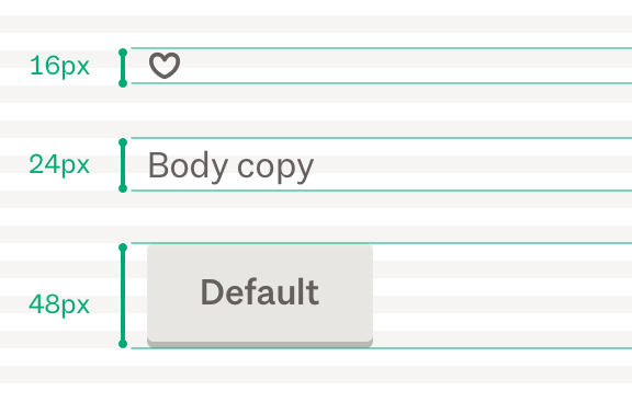
8px system
Tangram uses an 8px spacing system. All of our spacing units, sizing and line-heights are multiples of 8. When creating space use the $tg-unit
Component spacing
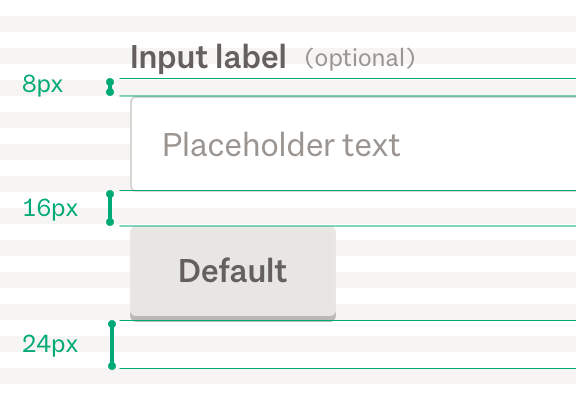
Most Tangram components come with a bottom margin and padding already set. We use different margin sizes from the set defined. The variation in sizes allow us to visualize different relationships between components. We try to only use bottom margins to avoid margin collapse.
Spacing sizes
Custom spacing is added to component stylesheets. When it isn’t possible to add spacing to component stylesheets, use spacing directives to override or add spacing.
Example
$tg-spacing-half Try not to use this variable. It is available if there are no other options.
This is half a unit to be used for spacing such as margins or padding.
Example
$tg-unitUsed to space out elements that are directly related (for example, a label and a form input).
Example
$tg-spacing-compact Used to space out elements that have a close relationship (for example, two form inputs, or a stripe’s label and the content slider below it). This is the gutter width of our columns at breakpoints below md
Example
$tg-spacing-base Base spacing between elements. This is the gutter width of our columns at the md
Example
$tg-spacing-medium For when you want to give more breathing room after a component (for example, after a <fieldset>
Example
$tg-spacing-largeUsed at the bottom of sections to differentiate content (for example, below the catsplat on the home page).
Example
$tg-spacing-extra-largeVery rarely used, available for when really large spacing is desired.
Sticker positioner
Used to position an element in a corner of its parent container.