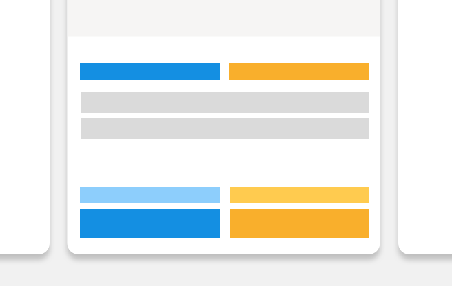
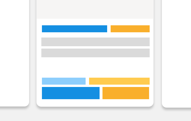
Card
A card contains an individual and independent piece of content. Use cards as a foundation to create context specific cards.
Example
Behaviour
- A card can be used as a link by using tgCard as a directive, i.e.
<a tgCard> - Cards do not include any padding.
- The height of a card is defined by its content. A height has been added to this demo to make the card visible.
- Content inside a card stacks vertically due to the flex setting of
flex-flow: column nowrap - To make cards the same height, apply
flexContentstg-row
Listing card design pattern
Within the Trade Me world, a listing card summarises the most relevant information about an individual listing.
Listing cards appear all across Trade Me in multiple contexts such as search results, recommendations and watchlists. They share characteristics, and are recognisable as cards regardless of the type of listing they represent.
Characteristics
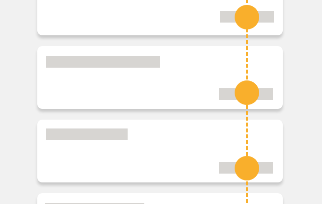
Listing cards are scannable.
They showcase the most important information about a listing. A customer needs to be able to differentiate between separate listing cards, and compare information easily.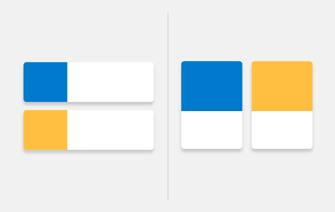
Listing cards are adaptable.
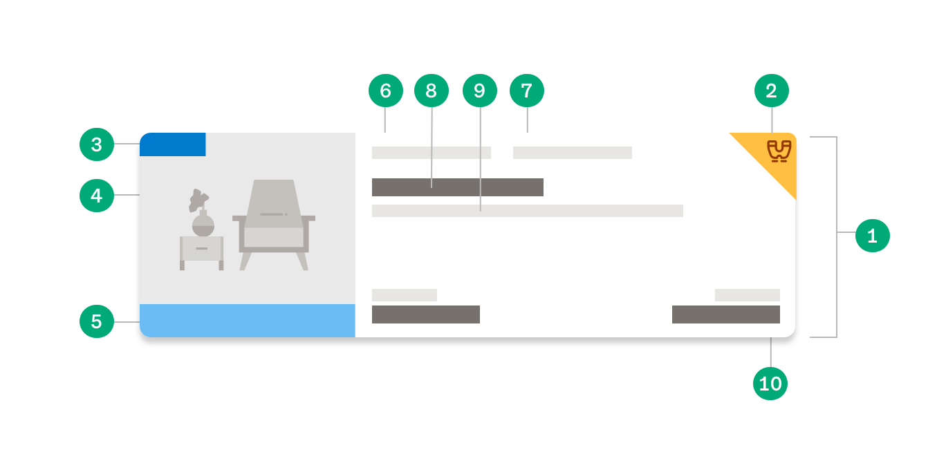
Cards can change their size and format depending on their surroundings.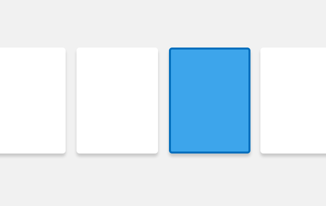
A card represents an individual piece of content.
Listing cards are individual and represent a single listing. When clicked, the card links to the listing page that the card represents.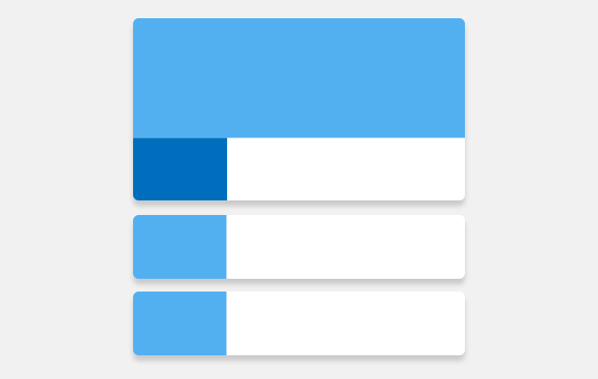
Cards are competitive and attention seeking.
They want the best spot in search results, and like to be dressed up with premium products to get the attention they vie for.Anatomy
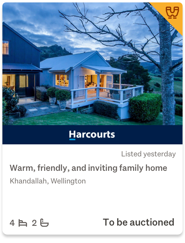
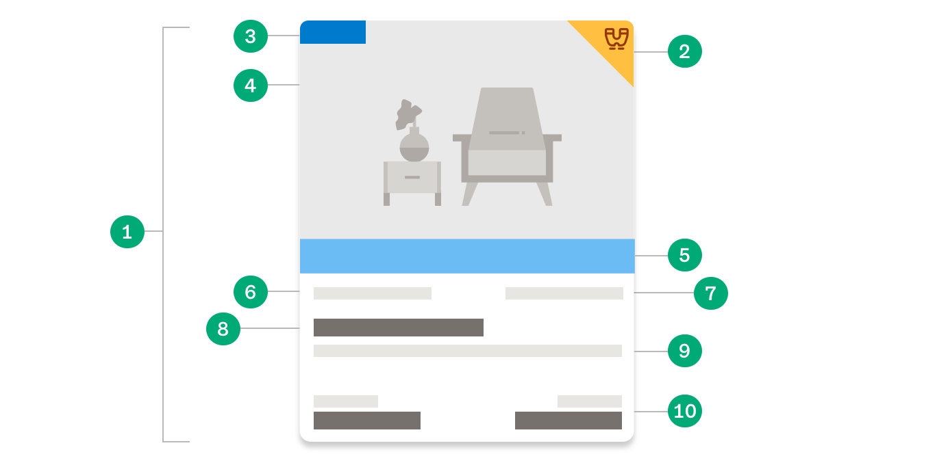
Listing cards across all areas of Trade Me are designed with a consistent hierarchy and placement for different elements.
1 Card layer
All content is contained within a foundation card layer. The entire area is interactive, and has softened rounded corners.
2 Watchlist fold
The only supplementary interaction. The watchlist fold allows customers to add an item to their watchlist. To indicate that a card has been watchlisted, the corner folds over.
3 Indicator (optional)
Indicates that the listing has a specific feature or attribute.
4 Image (optional)
For visual listing types, image is the most prominent element on a card.
5 Advertiser (optional)
Displays advertiser branding and colours.
6 Secondary content (optional)
Information such as listing location.
7 Listing date (optional)
Listing data such as listing starting or closing time and location. Text colour may change to indicate urgency.
8 Primary identifier
Unique content that identifies a listing, such as a title, property address or vehicle make or model.
9 Supplementary content (optional)
Small amount of extra detail about a listing.
10 Scannable content (optional)
The most important content a customer may need to scan and compare. This is always anchored to the bottom of the card. The most important scannable content (often price) is aligned to the right.
Hierarchy
Depending on the type of listing a card represents, emphasis is placed on different content.
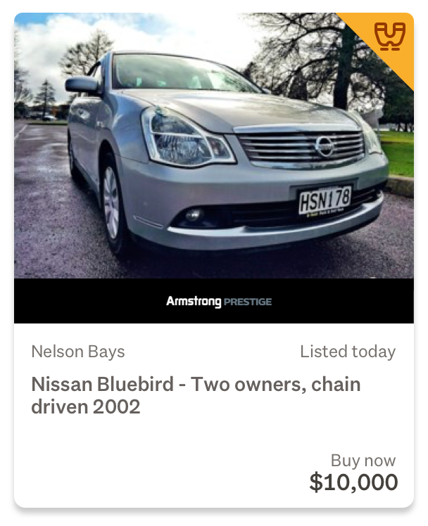
Example of a listing where imagery is the primary focus.
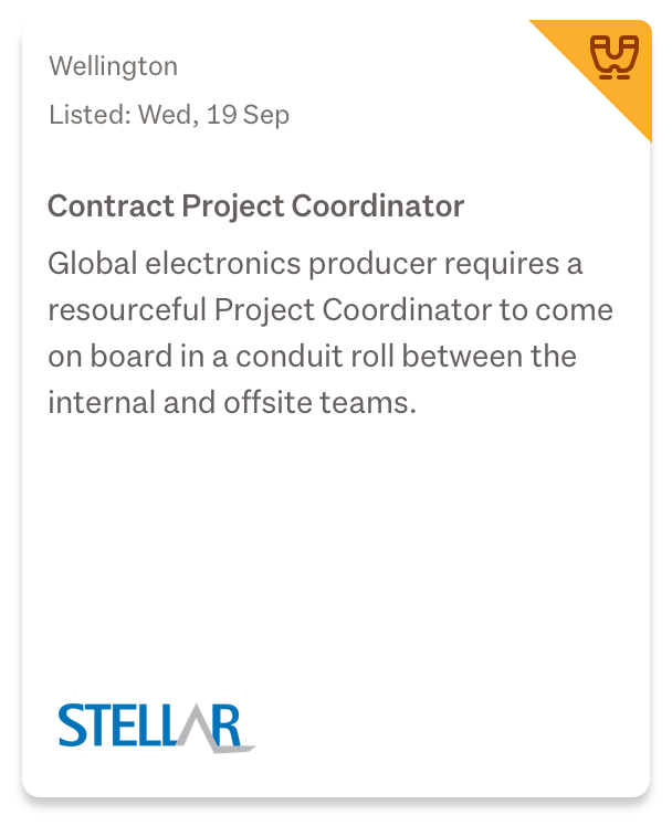
Example of a listing where details are the primary focus.
Typography and spacing
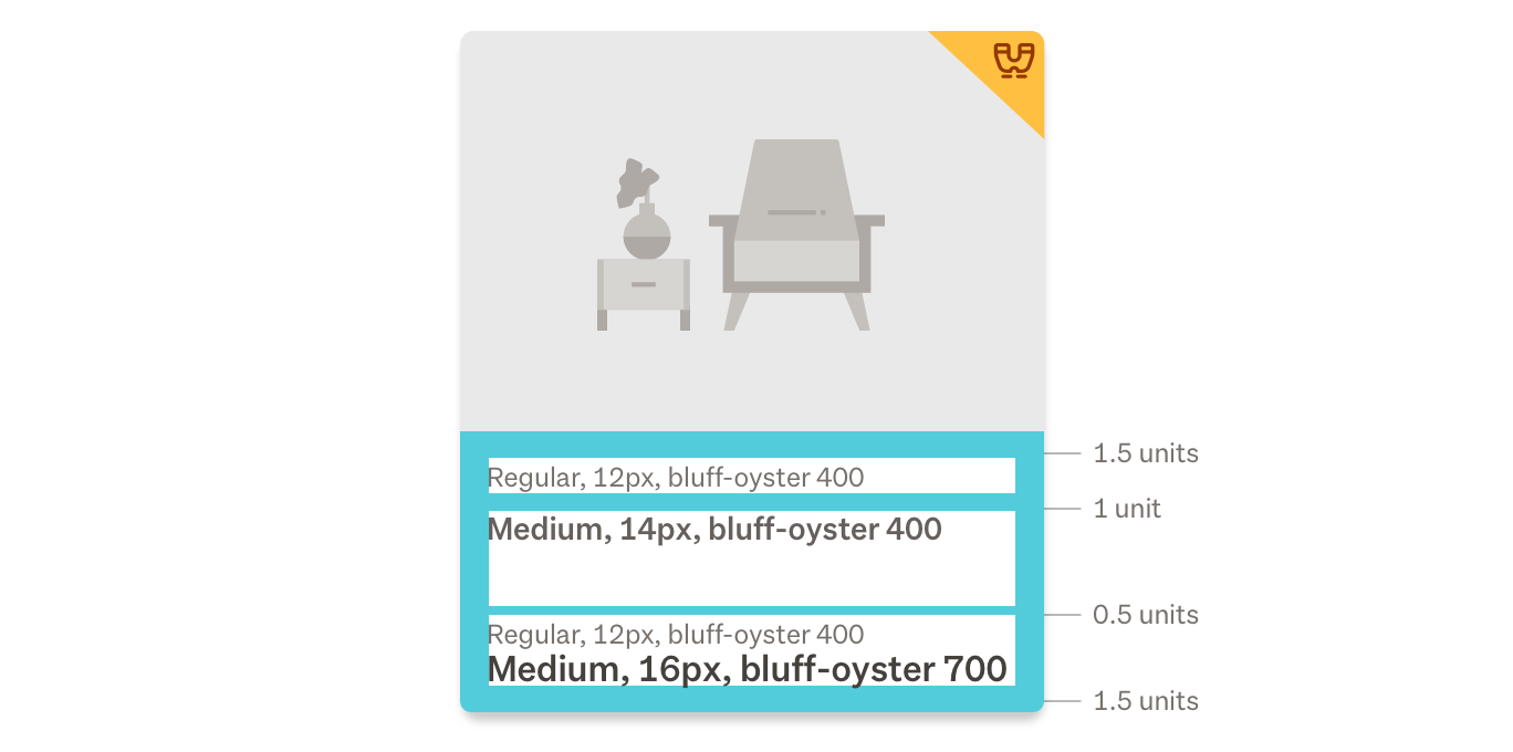
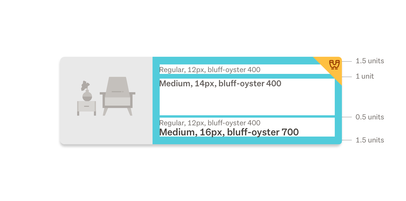
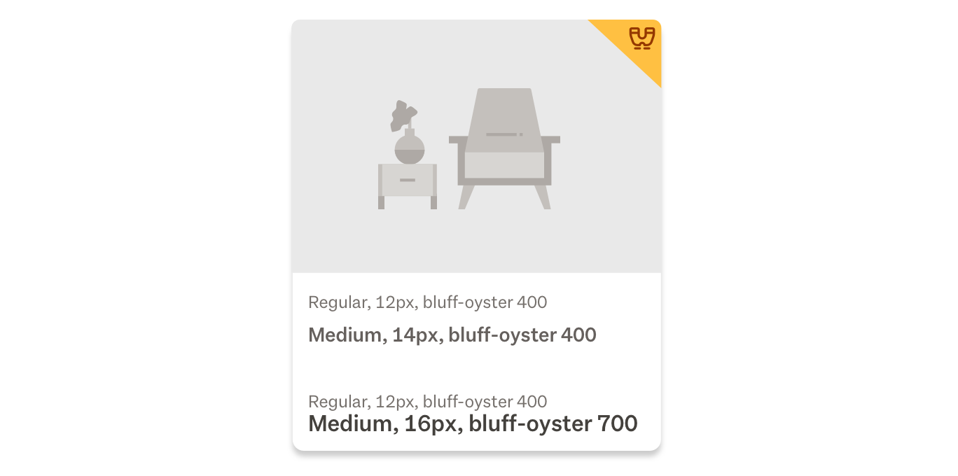
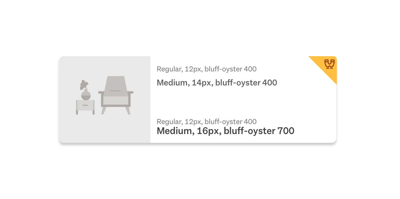
Listing cards have set type sizes for each element and consistent spacing, based off of the spacing unit system.
Card layer
We hero our member’s content by elevating cards above our own content. As interactive content, cards sit on the first layer above the ground layer of the site.



Cards invite interaction by raising up when hovered over. This is indicated by the change in shadow behind the card.
Cards cannot rest on top of one another. When they get too close to each other they start to push away. Like two same-poled magnets being forced together, they just won’t connect, and settle back to their natural spacing.
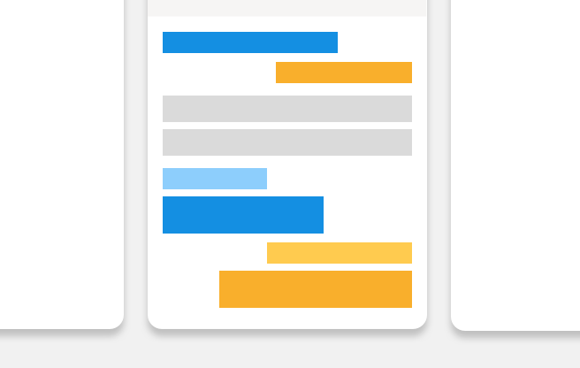
Responsive behaviour
Cards are flexible and respond to their environment. When resized, content within cards will push then stack.