Accessibility
We’re building a Trade Me for all of New Zealand, regardless of how they experience the web. We practice inclusive design and consider our customers with disabilities and impairments.
Tangram components are built with accessibility in mind, and can be used as a starting point by teams building an accessible web experience for our customers.
Accessibility is everyone’s responsibility
At Trade Me we share information and ideas, and help teams to understand how they can design and build features everyone can use. Check out resources and contribute on the accessibility Wiki space.
We follow the Web Content Accessibility Guidelines (WCAG). Our best practice guidelines help us with our aim of reaching WCAG level AA standard for our digital products.
Building Trade Me for everyone
Join the conversation at #accessibility
Structure
Well structured content allows users of assistive technology to more easily navigate a page, and find relevant content.
Headings
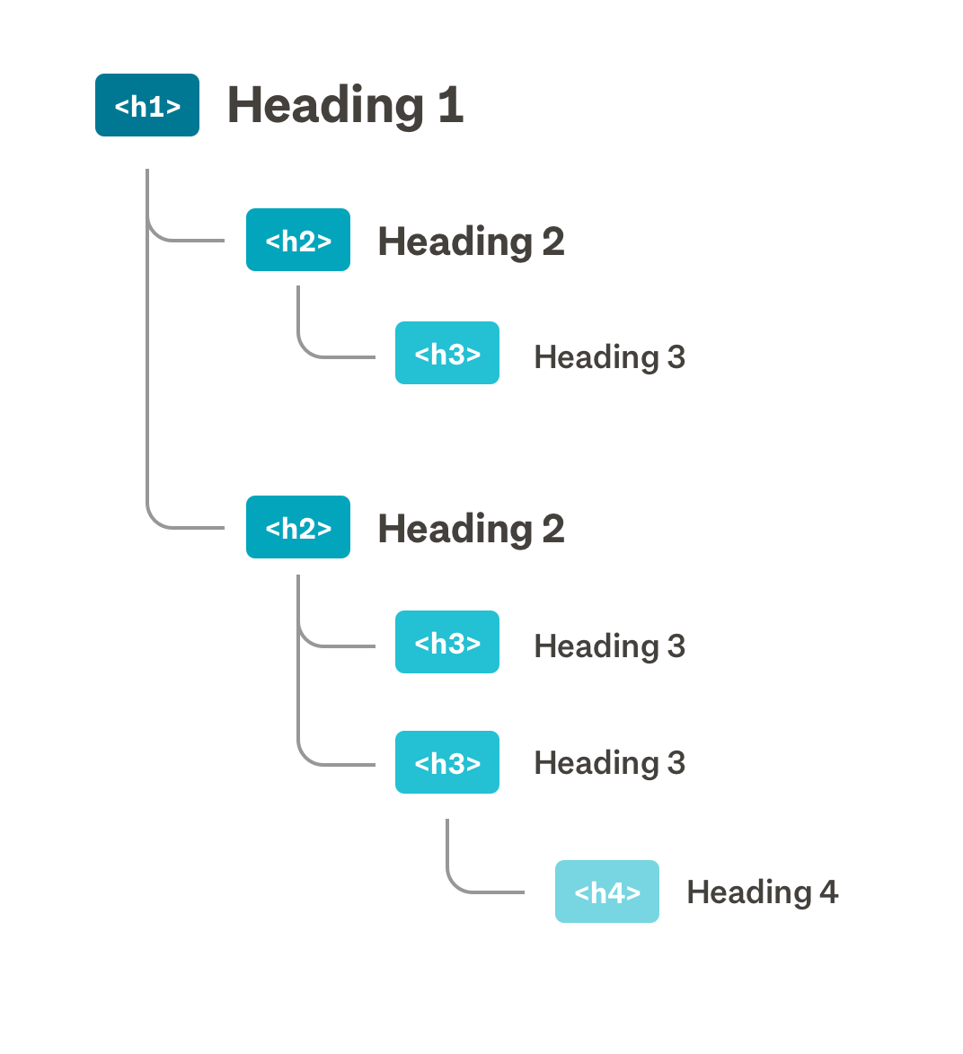
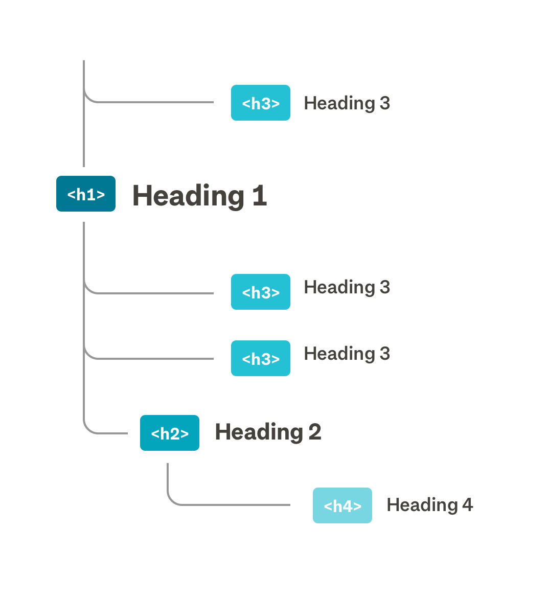
Informative headings and subheadings are used to structure the page.
Headings help to organise the page content into meaningful sections. Each web page should have a single <h1><h1>
To change the visual style of headings and retain the correct page structure, apply typography helper classes to headings. Headings can also be visually hidden using the visually hidden helper class so that they are still accessible to assistive technology.
<h3><h1>Landmark roles
ARIA (Accessible Rich Internet Applications) landmark roles help identify regions on the page.
By assigning appropriate ARIA landmark roles to elements, customers using screen readers are able to identify and skip to sections of a page.
HTML5 elements such as <main><header><nav>
When multiple page regions use the same landmark (eg. primary and secondary navigation), give them a unique label using aria-labelaria-labelledby
DOM order
The DOM (document object model) order matches the visual hierarchy and layout of the page.
Assistive technologies such as screen readers rely on the DOM (Document object model) order to present content to the user in a particular order. It’s important that the order of elements in the DOM are consistent with the visual hierarchy, so that they are grouped correctly by screen readers.
Ordering elements in the DOM is the main way to control the focus order of elements in the tabindex. If all styling was removed from a page, the content should appear in the order that you would expect it to be read.
Keyboard navigation
Some customers may interact with the web using only a keyboard, or with other assistive technology such as a screen reader. This may include customers with impaired vision, cognitive or motor abilities.
Checking whether your page is keyboard accessible
To check whether a page is keyboard accessible, navigate the page and complete tasks using only your keyboard. Move from one element to the next using the tabshift + tabEnter
Indicate focus
A customer should be able to clearly see which element is focussed, especially when navigating with a keyboard.
All Tangram components with interactive elements have a consistent focus state. When adding a focus state to a custom element, consider whether you want to show this on keyboard only interactions, or for all interactions.
Focus order
It is important that all interactive elements on the page can be navigated in a logical order. In New Zealand, this generally means following the page layout, from left to right, top to bottom.
By default, only interactive elements (links, buttons and form inputs) are focusable. To customise which elements are focusable, use HTML tabindex
tabindexFocus management
When removing the currently focussed element from the DOM, (for example, a form that has been submitted) focus must be managed to allow the customer to remain as close to the same place in the page as possible. You will need to decide which element should then receive focus, and programmatically set focus to that element.
At times, the best user experience may be to move the focus to a specific element, regardless of the currently focussed element being removed from the DOM. Take care to provide information through a screen reader to let the customer know where they have been moved from, and where they currently are on the page.
See focus service to find out how to manage and apply focus.
Avoiding focus traps
Interactive elements such as dropdown menus or modals are hidden until a user interacts with them. When this content is focussed and entered into by a user, there must be a way for the user to navigate out and return to the main flow of the page using only a keyboard.
Visual design
Colour and meaning
Colour is used alongside other visual cues to convey a message.
People see colour differently, and might not be able to tell different shades apart. Customers may also be listening to content using assistive technologies rather than viewing it on the page.
When using colour as an indicator, make sure there are other visual cues to convey the message. For example, include an icon when using green or red to show success or failure on a form.
Colour contrast
All critical content has sufficient colour contrast.
A high level of colour contrast between text and background is easier to read. This is important for customers with impaired vision, as well as customers temporarily impaired when viewing a screen in bright sunlight.
All critical content must meet at least WCAG 2.0 level AA standard for colour contrast. This requires a contrast ratio between text and background of 4.5:1 for body text, and 3:1 for large text and UI elements. Other critical elements such as icons, graphs, and maps must also meet this level AA standard.
Logos and decorative content such as illustrations do not need to meet the level AA standard.
Large text




Small text



Do use heavier font weights to make smaller text on a coloured background more legible.

Proximity
Related content is grouped together.
Grouping content and separating sections with whitespace makes content easier to understand. This helps when scanning the page, and reduces cognitive load for customers who have low vision or trouble focusing on a screen.
Keeping related content together also helps to keep information understandable for customers using screen magnification.
Interactive elements
Tap area
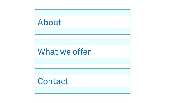
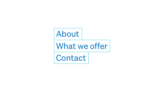
Interactive elements have a touch target of at least 48px by 48px.
A larger touch target reduces the chance of users tapping or clicking the wrong link. This is especially important for customers with fine motor impairments, as well as the larger thumbed among us.
On interactive elements that have a height of width less than 48px, add padding to increase the touch target.
When grouping interactive elements, consider adding margin around items to separate touch targets. If there is only one interactive element in an area, (eg. a link in a body of text) the touch target can be reduced.
Meaningful copy
Interactive elements are described with meaningful copy.
A user must be able to understand where a link will take them, or what action a button will trigger, regardless of other content around this interactive element.
Customers using assistive technologies often navigate a page by tabbing through interactive elements. Without the surrounding page content, lone icons or vague phrases like “click here” or “show more” don't tell customers where a link will take them. If necessary, add extra description to links and buttons using visually hidden.


Labelling interactive elements
Interactive elements such as form inputs are clearly labelled.
Content that relies on visuals alone to communicate may be missed by customers using a screen reader.

Without a label for the search field and a description for the button, this search bar but would be inaccessible to customers using a screen reader.
To help customers identify interactive elements you may need to add labels (even if these are visually hidden). The W3C guidance on labeling controls has good examples of different labelling techniques you can use for interactive elements that don’t automatically get an accessible name by screen readers.
Visually hidden content
Visually hidden content is used to communicate information to customers using assistive technologies.
Content can be hidden in a variety of ways. It is important to determine why the content is being hidden, and whether this should be hidden from all users or just hidden from the visual layout.
Always make sure that form fields are labeled, and then choose whether or not to display this label apply one of the visually hidden CSS helpers. When visually hiding labels on Tangram form components, apply showLabel=”false”
.h-visually-hiddendisplay: none;