Forms
Development documentation
There are common prerequisites, dependencies, and requirements which need to be imported and applied to all form components. This documentation should be read alongside the Angular forms, NgModel and FormControl documentation.
Angular inputs and directives
All Tangram forms components support the Angular model-binding directives ngModelformControlformControlName
All Tangram controls respond to standard Angular validation and status control, including [required][disabled]
Common inputs for Tangram form components
Design Guidelines
Example
Forms are one of the most important parts of digital product design. When forms are designed with cohesion, customers are able to focus on completing the task at hand. Our 10 guidelines:
- Use a single column layout to lead a customer through a form
- Form actions align with the form layout
- A call to action is most effective when it describes intent
- Group related information
- A short form is a good form
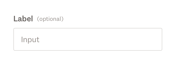
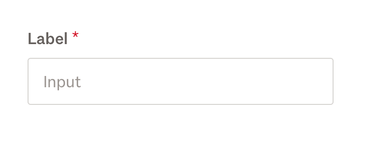
- Ditch the * and denote optional fields
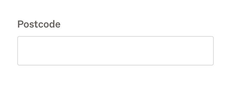
- Use input sizes to help indicate the desired content
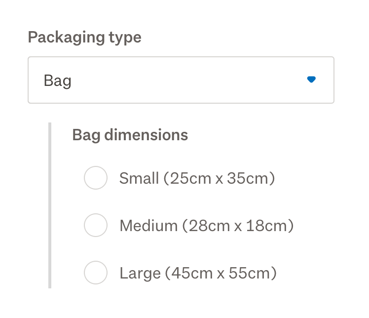
- Use the appropriate component for the number of options available
- Resist using placeholder text as labels
- Help text is only helpful when it is visible
Use a single column layout to lead a customer through a form
- A customer can more easily concentrate on a form if they only have a single direction to follow down the page. People can easily scroll vertically, however, scanning horizontally is significantly more difficult.
- It may be tempting to fill white space on a page at larger breakpoints, however white space helps to maintain focus on a form.
- Consider all breakpoints, to ensure the flow of a form is consistent.
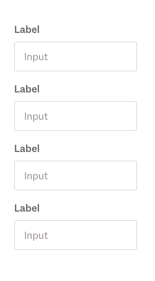
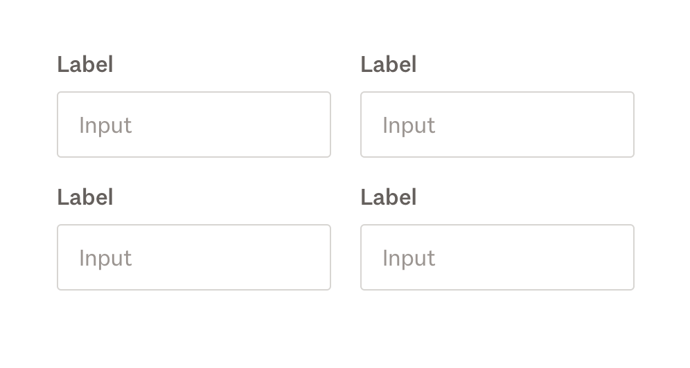
Exceptions
Occasionally, a form may require a different layout. The vertical landing pages on Trade Me are an example of this:
- These forms help customers get to search results quickly, and are effective in the larger context of the user journey.
- The form fields are all optional, featuring closely related information, and can be completed in any order.
- The form is one of many actions within the page. The vertical height is minimised to help balance with other content a customer may want to interact with.
When considering using an alternative form layout, consider:
- Does the form have optional questions and a non-linear flow?
- What does the page set out to achieve?
- What is the user journey this form sits within?
- Pay close attention to form interactions when user testing your layout.
Form actions align with the form layout
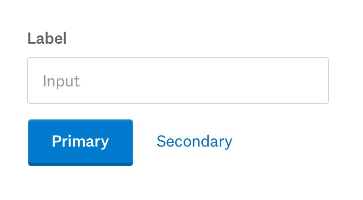
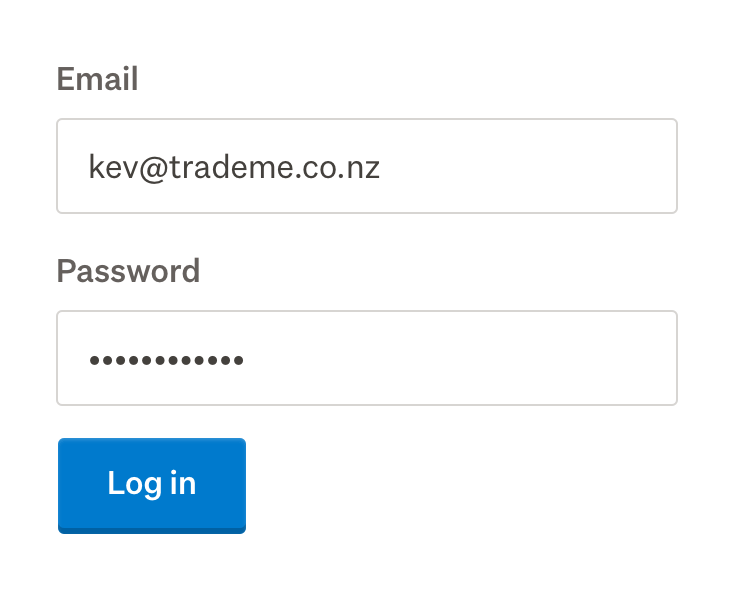
The primary button sits to the left, following the flow of the form inputs.
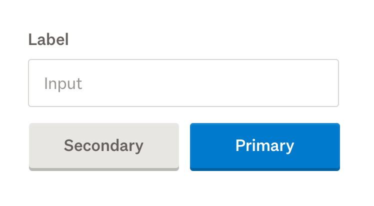
When options are equally weighted, buttons are displayed at equal width by using the grids.
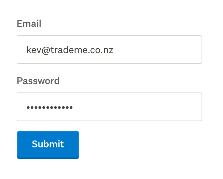
A call to action is most effective when it describes intent
For tips on writing effective call to actions, read the microcopy guidelines.
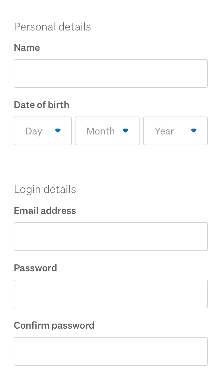
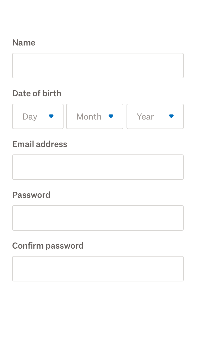
Group related information
Provide structure with form groups and headings so that the customer can move through the form without feeling overwhelmed.
A short form is a good form
Consider ways to remove optional fields. Ask yourself if the question can be inferred, postponed, or whether there’s another way to collect data.
Use nested form content to simplify forms, and hide content until it is relevant.
Ditch the * and denote optional fields
When we only ask the questions we need to, most fields in a form are required. Rather than introducing visual clutter of indicating required fields, Tangram form components indicate when a field is optional.
Use input sizes to help indicate the desired content
This is particularly helpful for inputs that have a defined character count.

Use the appropriate component for the number of options available
- For a choice between on or off, use a switch.
- When you have five or fewer options, use a radio group, checkbox group or a toggle.
- If there are over five options, use a select.
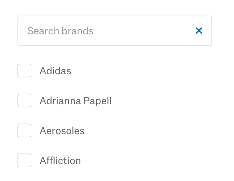
- If there are over 25 options, use components to build a search filter.
If there are over 25 options, build a search filter.
Resist using placeholder text as labels
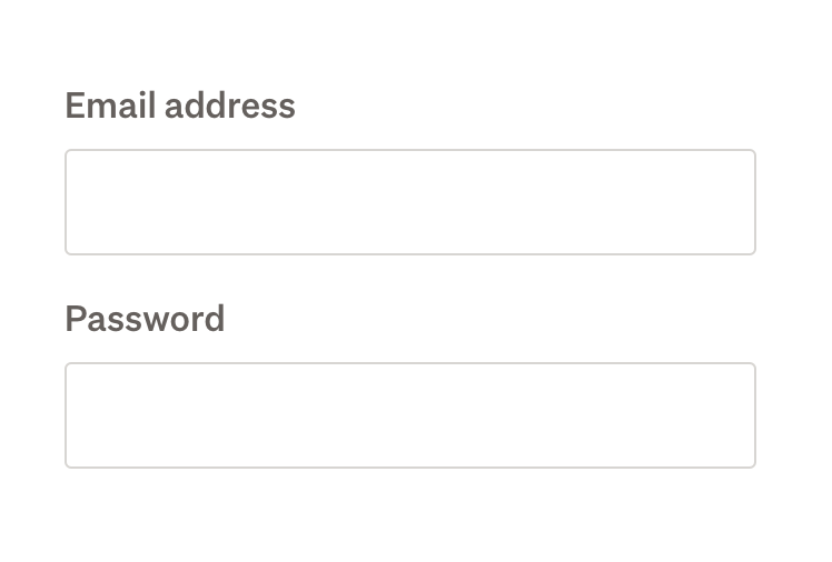
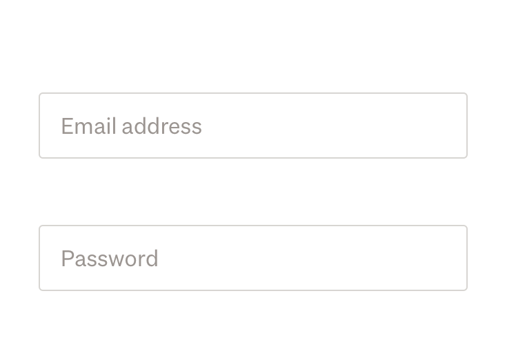
Using placeholder text instead of labels removes the accessibility and usability benefits that Tangram provides. Assistive technologies work best when a well structured label and input are used.
Read more about usability concerns of replacing labels with placeholder text.
Help text is only helpful when it is visible
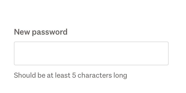
Tangram form components provide a placement for support text that doesn’t require customer interaction.
Checkbox
Enhance a single checkbox with Tangram styling and transitions.
When using multiple checkboxes, use checkbox group .
Example
Behaviour
- Checkboxes can contain nested form content.
- The checkbox touch area includes both the checkbox and label area.
- It is possible to nest controls within a Checkbox. Progressive disclosure can be implemented by using
*ngIfdisabled
Indeterminate
The indeterminate state represents a partial selection. It is typically used when some, but not all, child checkboxes in a group are selected. This state is purely visual and cannot be set by the user directly, it must be set programmatically.
Usage guidelines
- Use the indeterminate state when a parent checkbox reflects the mixed selection of its children.
- Do not allow users to manually place a checkbox in an indeterminate state, it should only reflect underlying data.
- Toggling the indeterminate checkbox should select or deselect all child items and remove the indeterminate state.
Behaviour
- Visual: Display as a checkbox with a horizontal line (or dash) instead of a checkmark.
- Interaction:
- Clicking an indeterminate checkbox should toggle all associated child checkboxes to either checked or unchecked.
- After interaction, the checkbox should move to a determinate state (checked or unchecked).
Checkbox group
Checkbox group allows more than one option to be selected at the same time.
For individual checkboxes, use a checkbox.
Example
Behaviour
- Checkboxes within checkbox groups can contain nested form content.
- Checkbox group uses a native
fieldset - A checkbox group has
margin-bottommargin-bottom
Colour picker
A colour picker allows users to select colour(s). You can insert a colour picker using either tg-radiotg-checkboxcolor
The colours available are limited to beige, black, blue, brown, cream, green, grey, orange, pink, purple, red, white, yellow, silver, gold and multi.
Example
Single select
Using radio group
Multi select
Using checkbox
File uploader
File uploader allows customers to upload files.
Example
Behaviour
- Clicking or tapping inside file uploader or drop zone prompts the native file uploader.
- File uploader will only handle interactive states for
tgButton2tg-dropzone - File uploader and drop zone is full width by default. To limit the size place it inside a
tg-col - When using drop zone without file uploader, you will need to implement drag and drop event handling.
- The
tg
Accessibility
- When a button is used with file uploader it must be removed from the
tabindextabindex='-1'<tg-file-uploader>
Depedencies
- ES6 string functions
startsWithendsWith
Form group
Form group wraps around a group of related inputs. It is used to validate whether the group is collectively valid. Form group validation messages only show once all of the individual inputs are valid. See forms validation for information on validation options.
Form group must be used with a directive that implements ControlContainerngModelGroupformGroupName
In this example, height and width are validated as numbers. We have added a custom validation function to ensure that the total area does not exceed 1,000.
Example
Behaviour
- If a disabled state is set on a
<tg-form-group><tg-form-group>
Input container
Input container extends the features and styles of native text inputs. Input and textarea elements that are wrapped by a <tg-input-container>
Example
Behaviour
- At the
smhalfonethirdonequarter - When using
<input>
Input group
Input group is used to group two or more related form controls.
Input group can be used as <tg-input-group><fieldset tg-input-group>fieldset
Example
Nested form content
Nested form content can be used to gather further information based on a customer’s selection. Nested content can be used with checkbox, radio group, and select container.
Any content can be nested in this content slot. <tg-input-container>
Nested inputs can be shown or hidden based on a customer’s interaction with a form. Progressive disclosure can be implemented by using *ngIf
You must manually bind disabled
Example
Usage guidelines
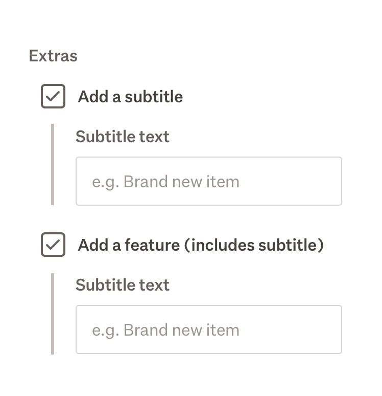
Avoid repeating the same nested form input under multiple options. Instead, look at restructuring form content.
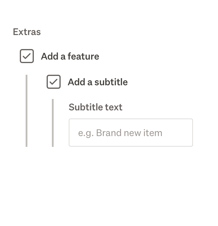
Avoid multiple levels of nesting.
Text input directive
The tgTextInput
Behaviour
- Unless "required" validation is added, all text inputs will be considered optional.
- Other native input attributes (e.g. autocomplete, placeholder, or autocapitalize) can be used.
- All inputs can be disabled using the standard Angular
disabled namengModel
Validation
Tangram provides a number of validators which apply to text inputs. These can be used with a tgTextInput
Currency formatting
Adding the currency directive to an input enables automatic currency formatting on the input (in addition to enabling currency validation).
Currency behaviour
- Currency enables automatic currency formatting when the control blurs. The ngModel value emitted is a number value accurately representing the entered number. The auto-format is flexible and discards additional whitespace and punctuation, but will consider any non-numeric text to be invalid.
- The currency directive enforces the input type=”tel”. On touch devices the numeric keyboard will be triggered. Manually setting the input type attribute when using currency will raise an error.
- Numbers will always be rounded to 2 decimal places (cents).
- Valid ngModel outputs will always be a valid float. Invalid inputs will be bound to NaN.
Textarea
Use <textarea>tgTextInput<tg-input-container>
Example
Behaviour
Avoid visual bugs by ensuring there is no whitespace between the opening and closing tags of a <textarea>
Radio group
Radios are a list of mutually exclusive options where it is important to present all available choices. Add an option of 'none' if there needs to be an unselected state.
Consider using a select when there are more than five options.
Example
Behaviour
Radio items within a radio group can contain nested form inputs.
Range slider
SliderRange
Range slider is a range control with dual handles and number inputs for precise value entry.
The range slider component provides a visual range selector with two draggable thumbs for minimum and maximum values. Users can interact with the slider by dragging the handles, using keyboard navigation, or entering values directly into the number inputs.
Example
Behaviour
- When the minimum value equals the lower boundary, or the maximum value equals the upper boundary, the input displays "Any" as an overlay. This overlay is hidden when the input is focused to allow typing.
- A "Clear" button appears when values differ from the range boundaries. Clicking it resets both minimum and maximum to the full range.
- The component validates that the minimum value is lower than the maximum value. When
min >= max - All values automatically snap to the configured
step - Users can click anywhere on the track to move the nearest thumb to that position.
- Keyboard navigation is supported on the slider thumbs:
- Arrow Left/Down: decrease by one step
- Arrow Right/Up: increase by one step
- Page Down: decrease by 10 steps
- Page Up: increase by 10 steps
- Home: jump to minimum boundary
- End: jump to maximum boundary
- Number inputs allow precise value entry. Clearing an input resets that value to its boundary (minimum or maximum). Values are automatically clamped to the configured min-max range.
- Screen readers announce thumb values using
aria-valuetextariaValueTextFn
Select container
Select container extends the features of a native select element.
Selects enable customers to choose a single item from a list of items. They are suitable when there are many options to choose from. Consider using radio where possible, as they allow users to see all available options at a glance.
Example
Behaviour
Select containers can contain nested form inputs.
Switch
Use a switch to make a choice between two binary options, such as on/off.
Example
Behaviour
- Switches are always left-aligned with the label sitting to the right of the switch.
- The tappable area is the entire row the switch sits in.
- Use a
tg-form-groupfieldset
Toggle
Example
Behaviour
- By default, toggle fills the width of its container with evenly spaced toggle items.
- Pre-select a toggle item by using two-way binding on
ngModeltgToggle - Toggles are a radio group with button-like styling.
Validation
Example
Tangram provides validation directives for common situations. These are used alongside Angular validators.
Required items
These validators only run when a value is provided. An empty input field will be valid. Use the Angular required
| Type | Method | Description |
|---|---|---|
| Currency | [currency] | Validates that the input string contains a number formatted as New Zealand currency. |
[currencyMin]: number | Validates that the string is at most the given value. | |
[currencyMax]: number | Validates that the string is at least the given value. | |
[email]: string | Validates that the given string contains an @type='email' | |
| Number | [number] | Validates that the given string is a valid number. |
[numberMax]: number | Validates that the input string is at most the given value. | |
[numberMin]: number | Validates that the input string is at least the given value. | |
| Postcode | [postcode] | Validates that the value is a New Zealand postcode of four digits. |
Validation summary
Validation summary provides up-to-date information of any validation issues on a form. It is especially useful on long forms as it helps the user to discover validation issues.
Place validation summary above the submit button.
Validation summary appears when an invalid form is submitted. To observe this, submit the example form below without entering content.
Example
Behaviour
The content inside validation summary automatically updates as issues are resolved, and disappears when all issues have been resolved.
Custom validation directive
Use this directive when creating your own custom validation.
The validation directive can be applied to any form input or group with ngModelngModelGroup
Example
Validator interfaces
These are provided by Tangram to allow you to create your own custom validators.
ValidationConfig
interface ValidationConfig {
    [validation: string]: ValidatorConfig | string;
}
ValidatorConfig
interface ValidatorConfig {
    message?: ValidatorMessageFn | string;
    validator?: AsyncValidatorFn | ValidatorFn;
}
Note: AsyncValidatorFn and ValidatorFn are Angular interfaces.
ValidatorMessageFn
type ValidatorMessageFn = () => string;