Logo
Our logo is made up of two parts: our wordmark and our favourite blue kiwi, Kevin!
Kev is made from the most basic shape in life, a circle. You've seen him before – in your fruit bowl, or at the beach. Our wordmark is set in Galano Grotesque, a geometric typeface which reflects the circular forms that make up Kev.
Masterbrand
Our masterbrand logo has a number of different versions. Each variation is made fit for purpose, to make sure that Kev, and our brand, is always looking its very best! Refer to our handy usage guide to find out how to apply these logos.
Standard logo
Our standard logo is always your first port of call. Make sure you use this standard version wherever possible.

Width: above 131px (46 millimetres)
Standard logo variations
Small
The small logo is perfect for small spaces that are less than 130px in width. The small logo ensures Kev is clean and clear at small sizes.
Download logoWidth: 70px – 130px
Inverted
This logo is your go to when the logo needs to sit on a dark background.
Download logoBlack
Use this logo when you have a single colour print project.
Download logoStacked logo
The stacked logo is designed for the rare instance when our horizontal logo won’t fit e.g. in a square space.
Full colour
Use the full colour version where ever possible.
Download logoInverted
Use the inverted logo when the logo is sitting on a dark background.
Download logoBlack
Use this logo for single colour print projects.
Download logoKevin
Kev can also be used on his own to show his personality and charm. Kevin must never be used in place of our logo.
Circle Kevin
Kev within a circle is used in our social media profile images.
Download Masterbrand circle KevinSquare Kevin
This version is used for both our social media and app icons.
Download square KevinSub-brands
When representing our sub-brands, be sure to use the logo that is best suited to your needs. Below are the different logo variations you can choose from.
Standard logo

Width: 170px and above (60 millimetres)
Standard logo variations
Small
The small logo is perfect for small spaces that are less than 170px in width. The small logo ensures Kev is clean and clear at small sizes.
Download logoWidth: below 170px
Inverted
This logo is your go to when the logo needs to sit on a dark background.
Download logoBlack
Use this logo when you have a single colour print project.
Download logoStacked logo
The stacked logo is designed for the rare instance when our standard logo won't fit, e.g. in a square space.
Full colour
Use the full colour version where ever possible.
Download logoInverted
Use the inverted logo when the logo is sitting on a dark background.
Download logoBlack
Use this logo for single colour print projects.
Download logoSans Kevin logo
Avoid a double Kev faux pas! Go sans-Kev only when the masterbrand is used in close proximity.
Pohutukawa
This version is used only when the masterbrand logo is in close proximity.
Download logoInverted
Use the inverted logo when the logo is sitting on a dark background, and the masterbrand logo is in close proximity.
Download logoBlack
Use this logo for single colour print projects, and the masterbrand logo is in close proximity.
Download logoKevin
Circle Kevin
Kev within a circle is used in our social media profile images.
Download circle KevinSquare Kevin
This version is used for both our social media and app icons.
Download square KevinUsage guide
Follow our guide to make sure that Kev is always looking his best.
Clear space
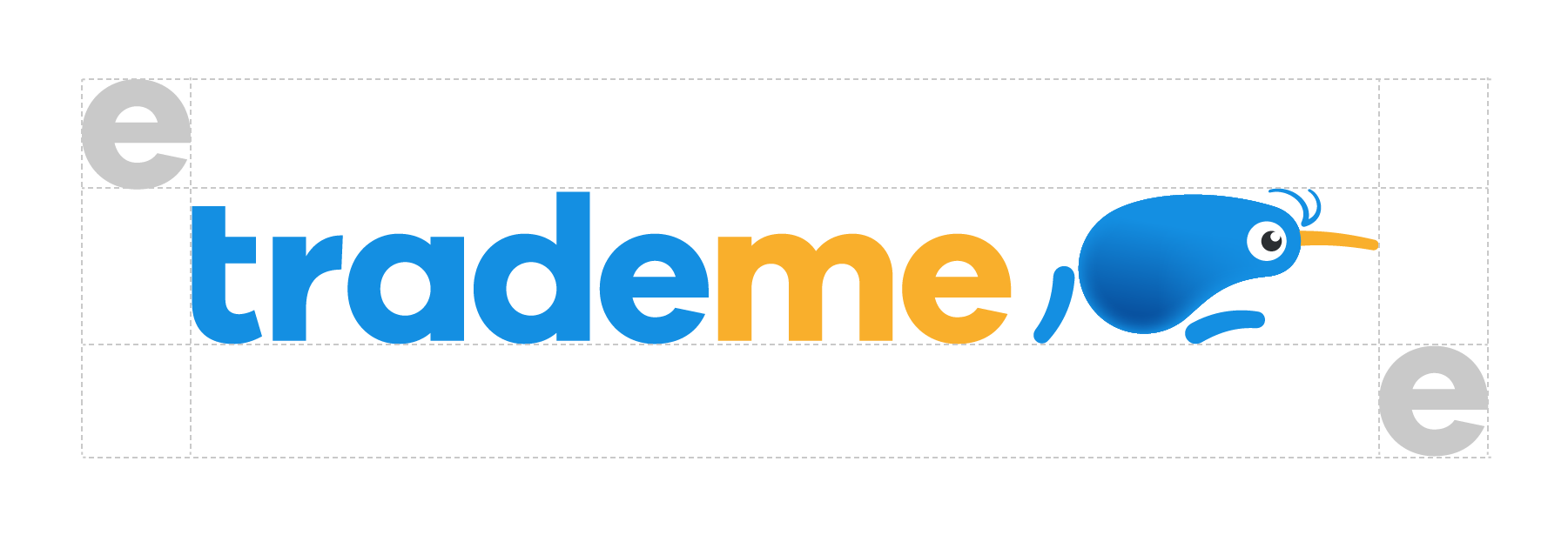
Always give our logo some breathing room. The clear space is defined by the ‘e’ in Trade Me. The same spacing applies to all of our sub-brand logos.
Do’s and dont’s
Do: Hokey Pokey and Tasman are the two main colours that feature in our logo.
Don't: Don’t remove Kev from our masterbrand logo, he is essential to our brand.
Do: Our logo works best on lighter or neutral coloured backgrounds.
Don't: Don’t put our logo on coloured backgrounds where it won’t be easily seen.
Do: Kev likes to look good by staying crisp and clear. Always use the high resolution logo.
Don't: Kev doesn’t like being squashed or stretched.
Do: When using our logo on a dark background, use the inverted logo. The difference is the key line around Kev’s eye.
Save Kev from becoming a zombie. Don't create your own inverted logo. Always use the one supplied. Note how Kev's eye is wrong above.
Don't: Kev is a key brand element. Avoid diluting his impact by using multiple blue kiwis on one page.